Niyama
Challenge
Niyama needed a recognizable, bold identity that would work seamlessly across physical and digital media, including:
Outdoor advertising (billboards, signage);
Branded packaging for sushi, rolls, and pizza;
Promotion of the restaurant’s mobile app and campaigns.
The goal was to create a visual language that:
Instantly catches attention,
Clearly communicates the brand,
Encourages users to interact with the business via app downloads and promotions.
Solution
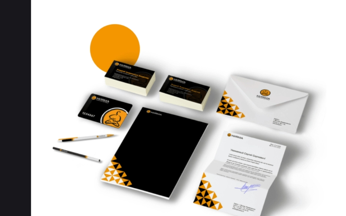
We developed a comprehensive identity system and modular packaging that solved both visual and technical challenges.
Design Approach:
Billboards & outdoor visuals use strong geometric patterns and high-contrast color combinations to ensure brand recognition from the first glance;
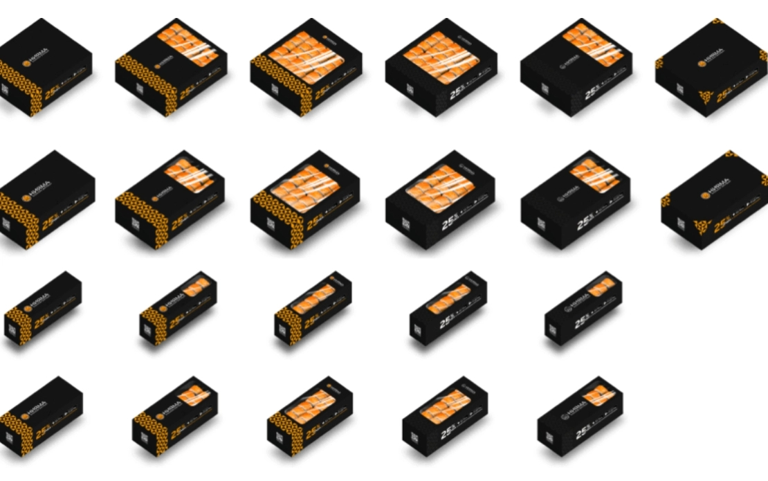
Sushi & roll packaging includes:
Up to 7 unique box designs for sets of different sizes;
Open-lid window for product display;
Side wall space for promotions and QR codes linking to the mobile app;
Pizza packaging:
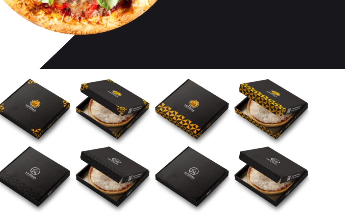
Flat, wide surface adapted to various styles (from bold patterns to minimalism);
Multiple versions created with pattern and logo variations;
Structural variations in packaging design:
Fully removable lids,
Pull-out box mechanics,
Dual-opening hybrid constructions.
Results
The new brand identity for Niyama achieves:
Instant visual recognition through the use of a bold black and orange color palette;
A distinct, modular tile pattern that's both clear and memorable;
Packaging that works as a marketing tool — showcasing the product and driving engagement through integrated promotions;
Adaptability for both print and digital platforms, with optimized color schemes and scalable design components.
Niyama now has a flexible and cohesive identity system that not only elevates its look and feel, but also actively supports its marketing and customer engagement efforts.


