May 28, 2024
No image

Service categories
Service Lines
Design
Domain focus
Other
Subcategories
Design
Graphic Design
Illustration
User Experience
Challenge
The main challenge for Boolo was to develop a design that would effectively meet the needs of both employers and job seekers in the IT industry. In the competitive landscape of job search platforms, the project needed to stand out by offering a user-friendly interface, comprehensive job search filters, and a visually appealing design. Additionally, meeting the unique needs of the IT industry and building a strong brand has presented challenges in terms of design and functionality.
The main challenge for Boolo was to develop a design that would effectively meet the needs of both employers and job seekers in the IT industry. In the competitive landscape of job search platforms, the project needed to stand out by offering a user-friendly interface, comprehensive job search filters, and a visually appealing design. Additionally, meeting the unique needs of the IT industry and building a strong brand has presented challenges in terms of design and functionality.
Solution
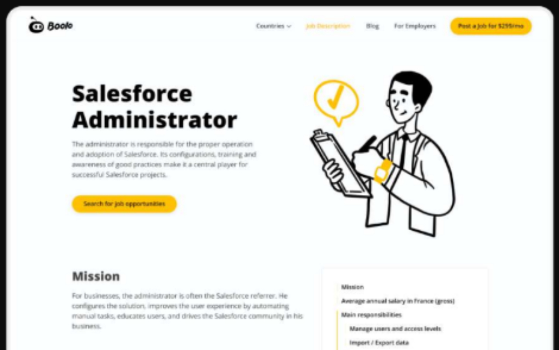
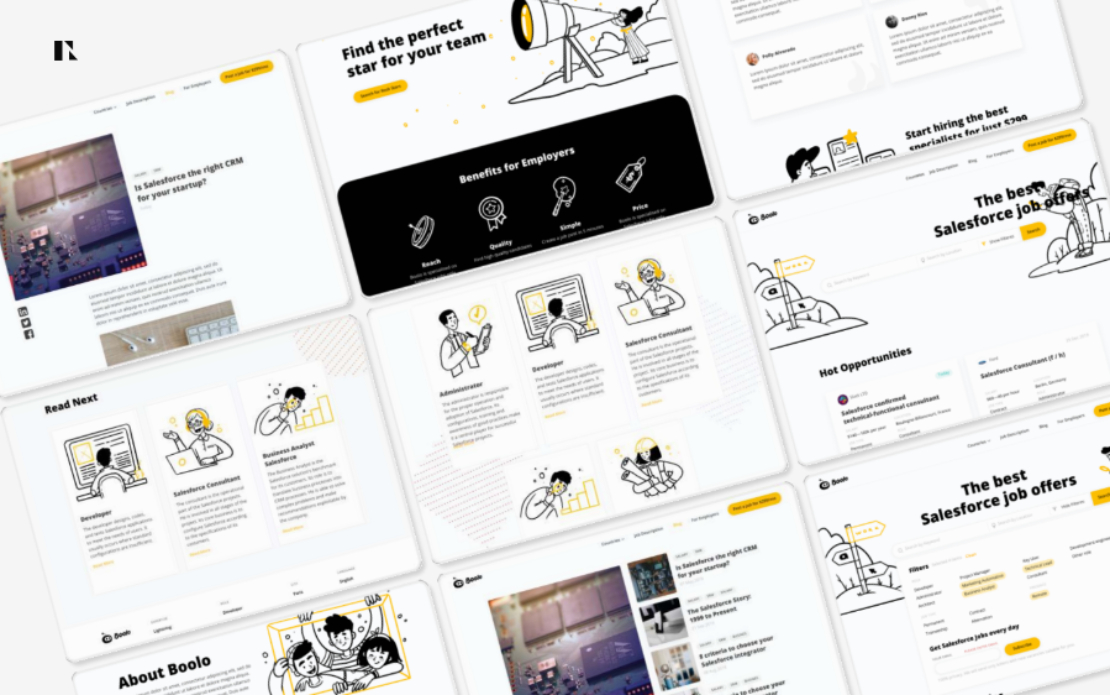
The UI/UX design has a simple and clear structure, allowing users to easily navigate the application and find suitable jobs. Comprehensive job search filters have been implemented, allowing users to refine their search based on criteria such as location, skill set, experience level and more.
Unique graphical people icons have been designed to enhance the app's visual appeal and reinforce its focus on connecting employers and job seekers. The brand identity was created using a minimalist colour scheme of black, white and yellow, creating a sleek and modern look that resonated with users in the IT industry.
Results
Key results of the project included:
- Improved user interface. A simple and clear structure, comprehensive job search filters and visually appealing design contributed to an improved overall user experience, resulting in increased user satisfaction and engagement.
- Distinctive Branding: Designing unique graphic icons and creating a minimalist brand identity has helped Boolo stand out from its competitors and establish a strong brand presence in the IT industry.
- Increased user engagement. An intuitive interface and user-centric design approach encourages users to actively interact with the application, leading to increased usage and adoption.
No image

No image

